The brief.
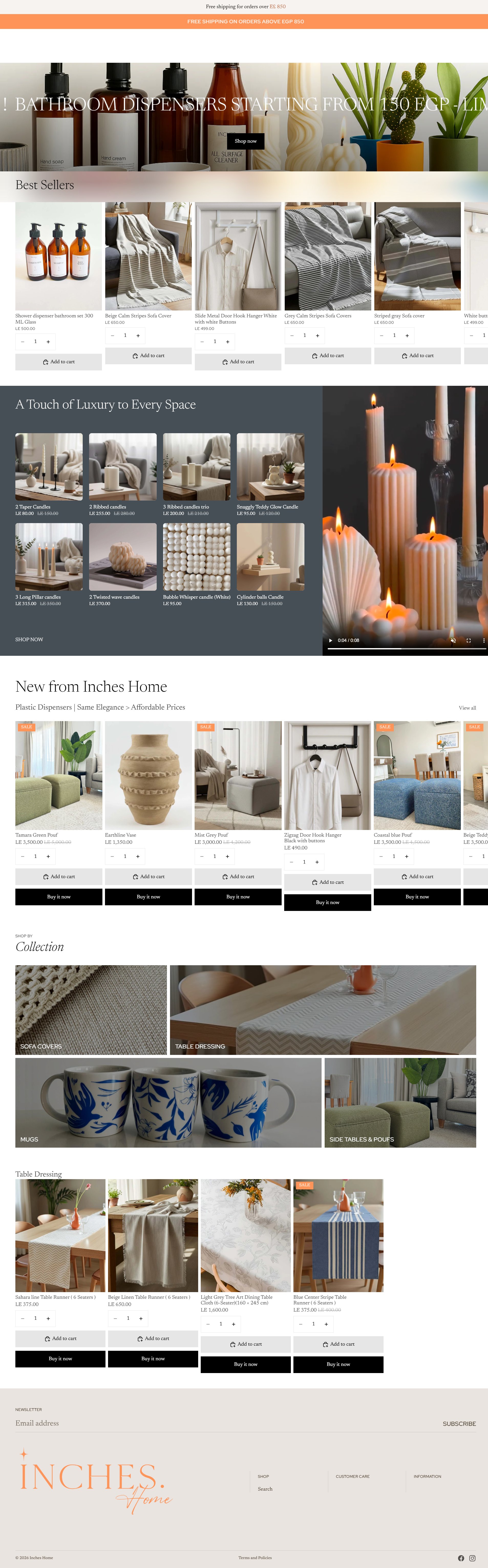
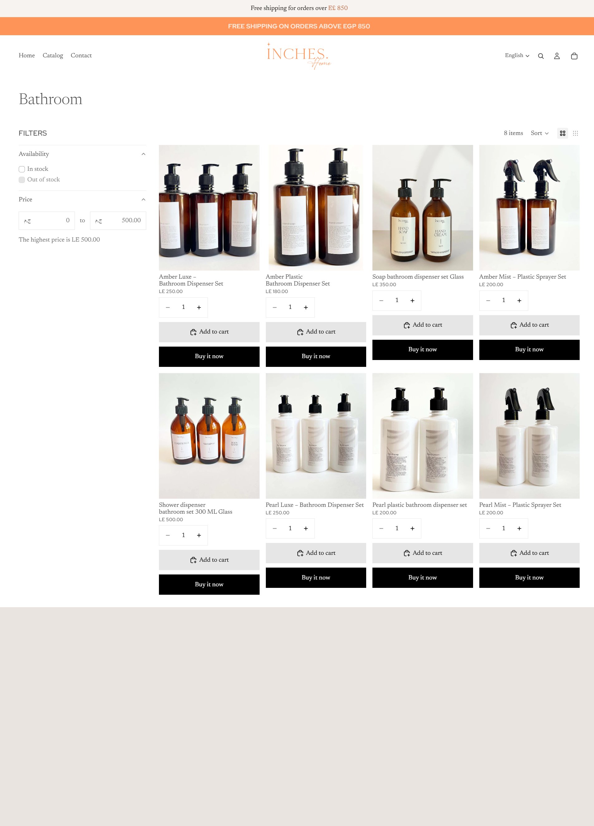
Inches Home wanted a Shopify storefront that felt as considered as their products. The catalog spans bathroom dispensers (amber and pearl variants), sofa covers, table runners, candles, mugs, and side tables & poufs — every category demands a different merchandising treatment. A generic theme couldn't hold all of that without looking like a generic theme.
What we shipped.
Sections built around merchandising, not the other way around.
The home page is a series of dedicated Liquid sections: a "BATHROOM DISPENSERS STARTING FROM 150 EGP" promo strip, a Best Sellers carousel, a "Touch of Luxury to Every Space" candle showcase with a vertical video, a "New from Inches Home" sale grid, and a sofa-covers / table-dressing / mugs / side-tables panel. Each section is metafield-driven so merchandising can move without dev tickets.
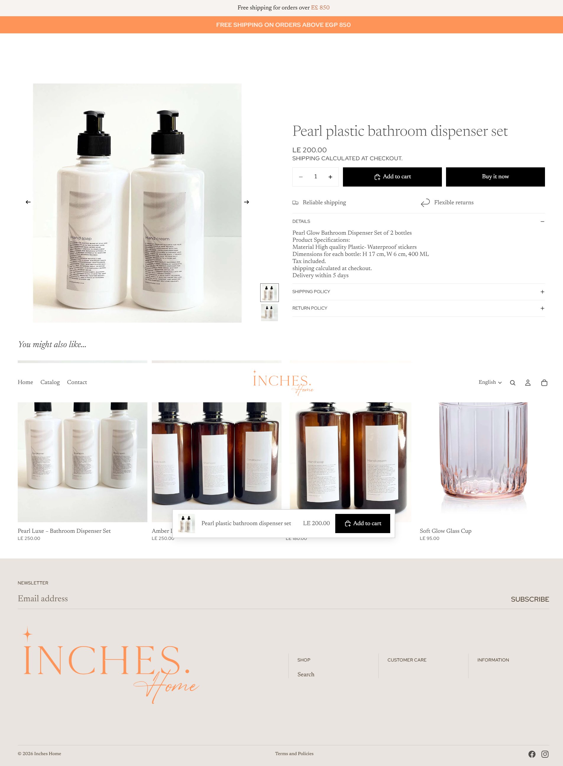
A product page that doesn't blow up.
Five dedicated block types on the PDP, an SVG-icon accordion that survives Shopify's HTML sanitization, and a sticky add-to-cart on mobile that floats the price + CTA without breaking layout. The footer-as-floating-CTA pattern (product image + name + price + Add to cart) ships across the catalog.
The compare page.
Built on a client-side fetch architecture — selected products are pulled live by ID, not server-rendered. Survives merchants editing variants behind the scenes; no caching to bust.
The boring fix.
Across every section, a delegated data-lq-action handler replaces hand-wired event listeners. Hyphenated identifiers (a regular Shopify variant pattern) stop breaking JS. Less code, fewer bugs.